Brown + Pale Pink: The Warm Neutrals Upgrade
January 7, 2026. Brown is more elevated than black. Pink is no longer naive. Seen across FW25 and SS26 runways, this neutrals pairing quietly rewrites the rules of office color—warm, controlled, and far more powerful than it looks. Think of it as an alternative to your most reliable neutrals, when you’ve had enough of black, navy, or grey.
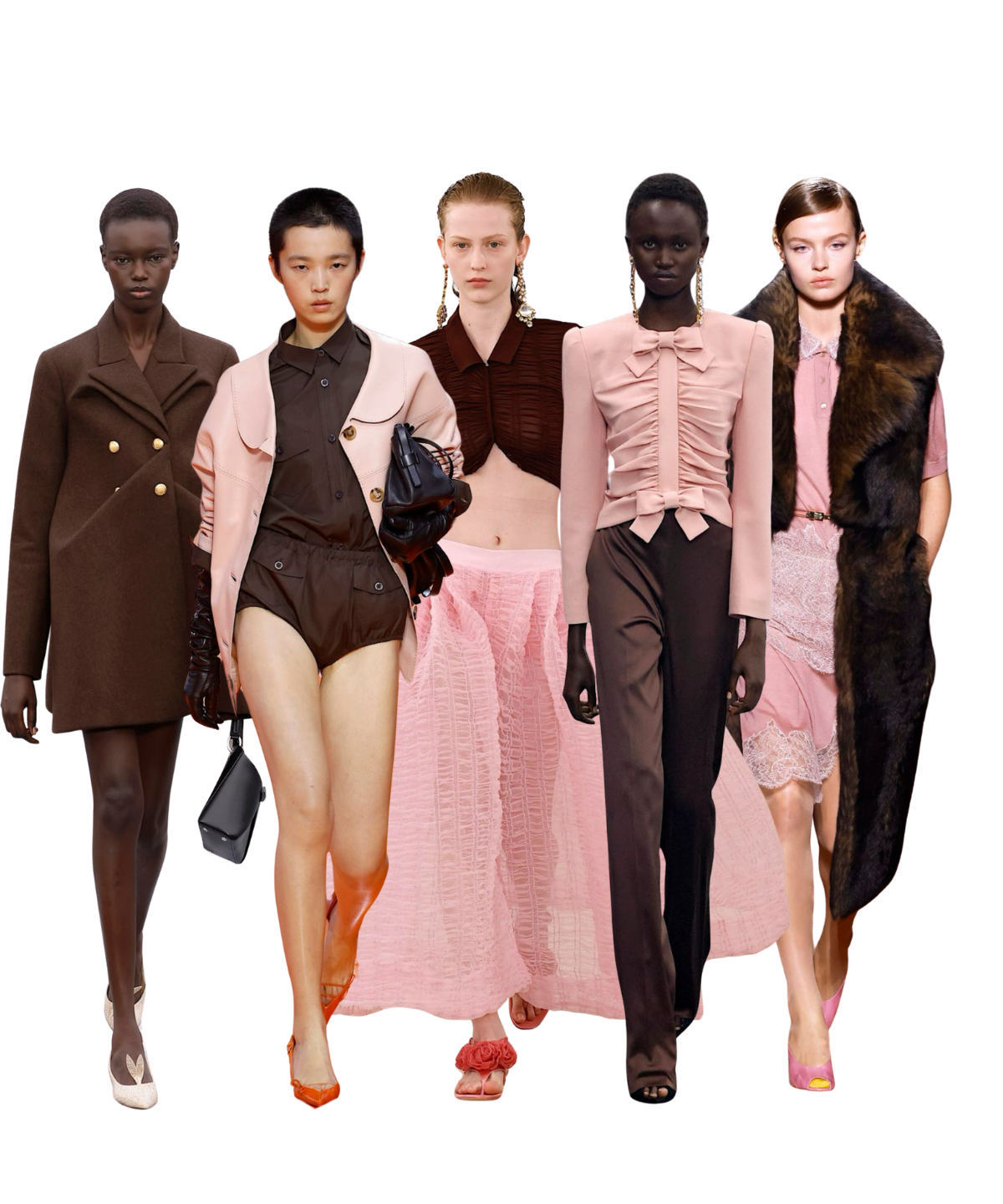
Seen at Fendi, Valentino, Dior, Prada, Elie Saab, Giambattista Valli, the combination shows up in tailored coats, structured tops, fluid blouses, and disciplined outerwear. Translated to work, it offers a way to look authoritative without looking severe—and feminine without being decorative.
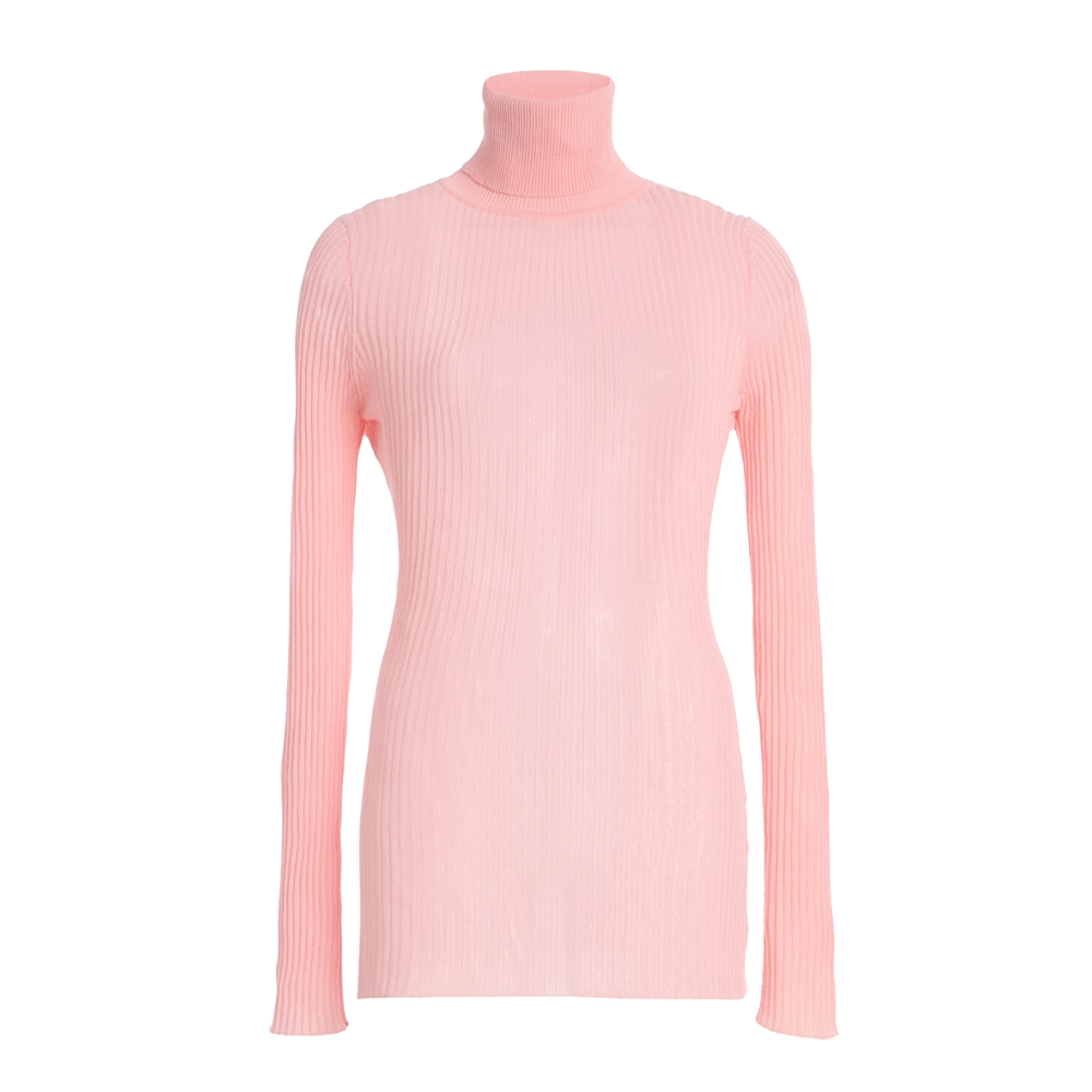
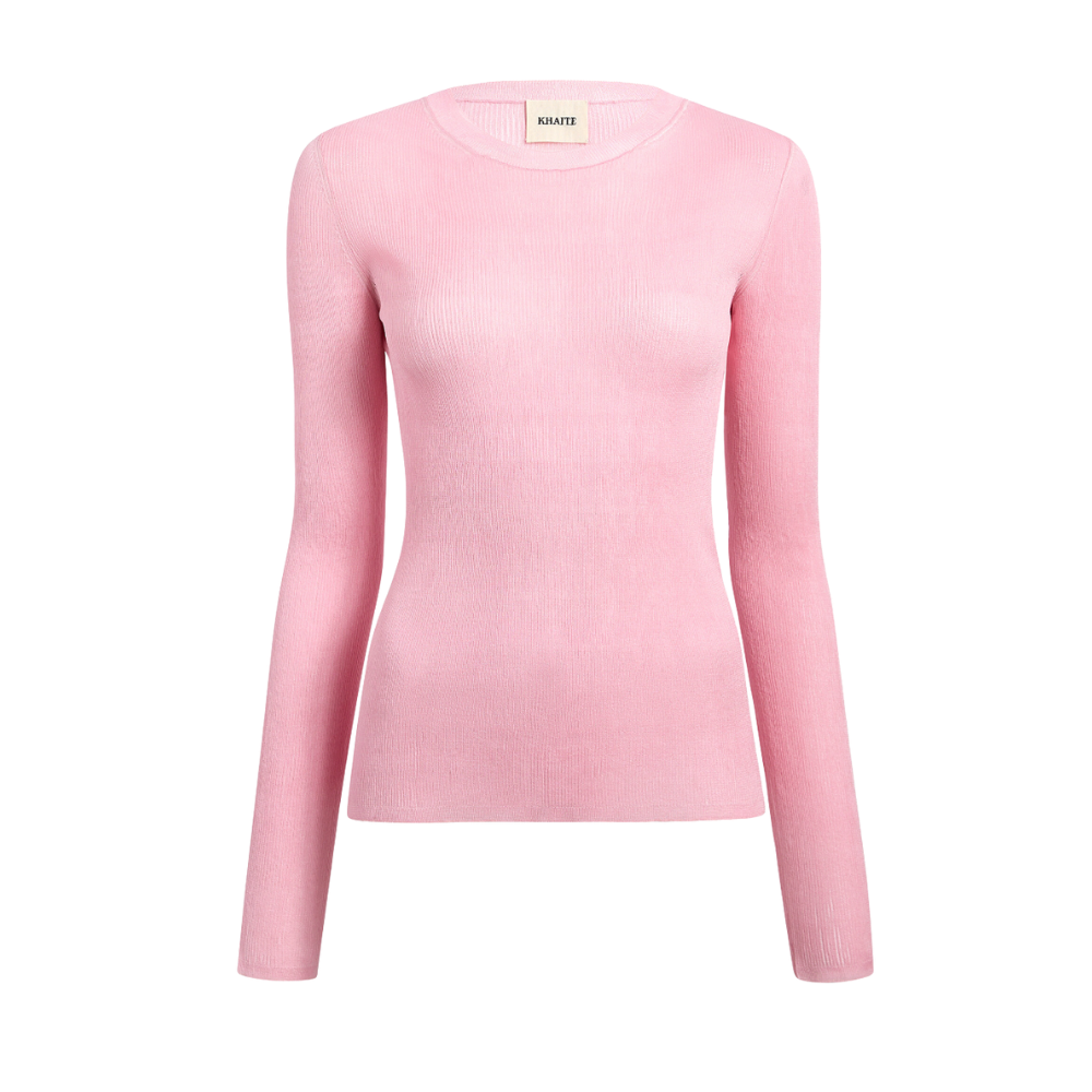
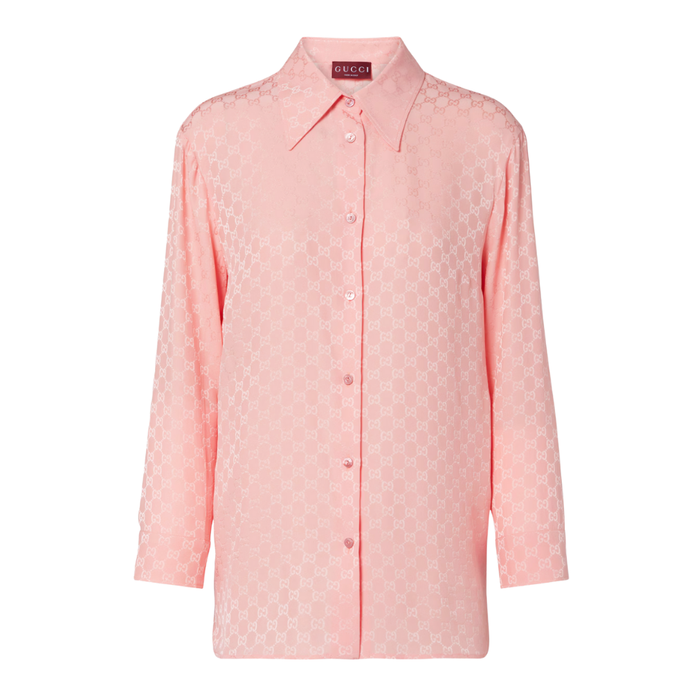
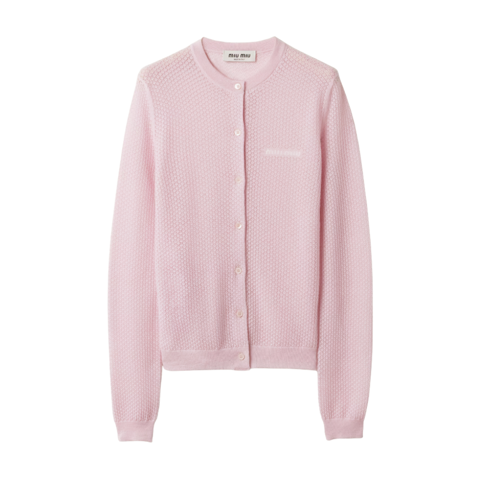
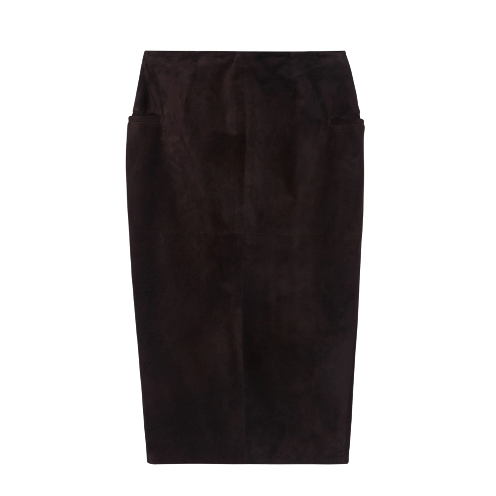
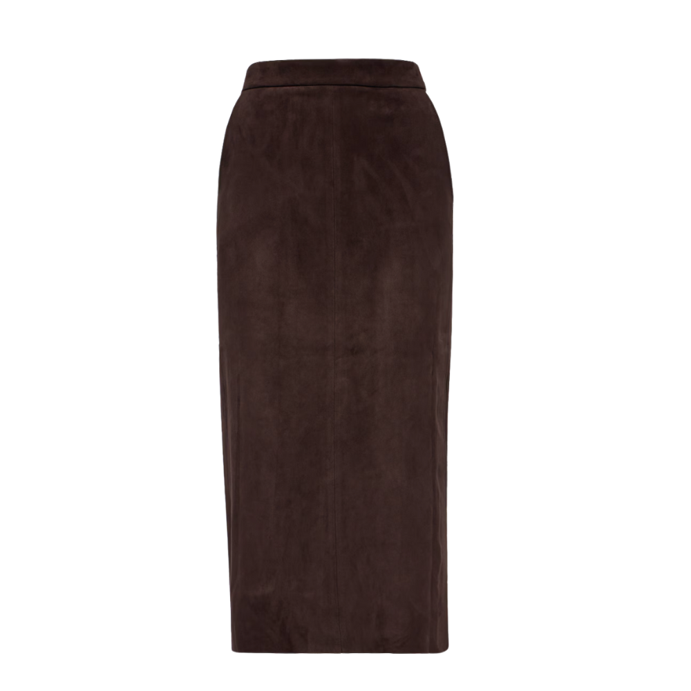
rown has reasserted itself as a serious base neutral, offering a welcome alternative to black, grey, or navy—especially for women who want authority without severity. Pale pink, used above the waist, brings light and dimension without reading decorative or casual. Together, they form the basis of a palette that feels modern, intentional, and credible in professional settings. On their own, however, dusty pink and chocolate brown risk looking too muted. The pairing only comes fully into focus when sharpened by a precise accent—most often gold, sometimes red or orange—used sparingly.
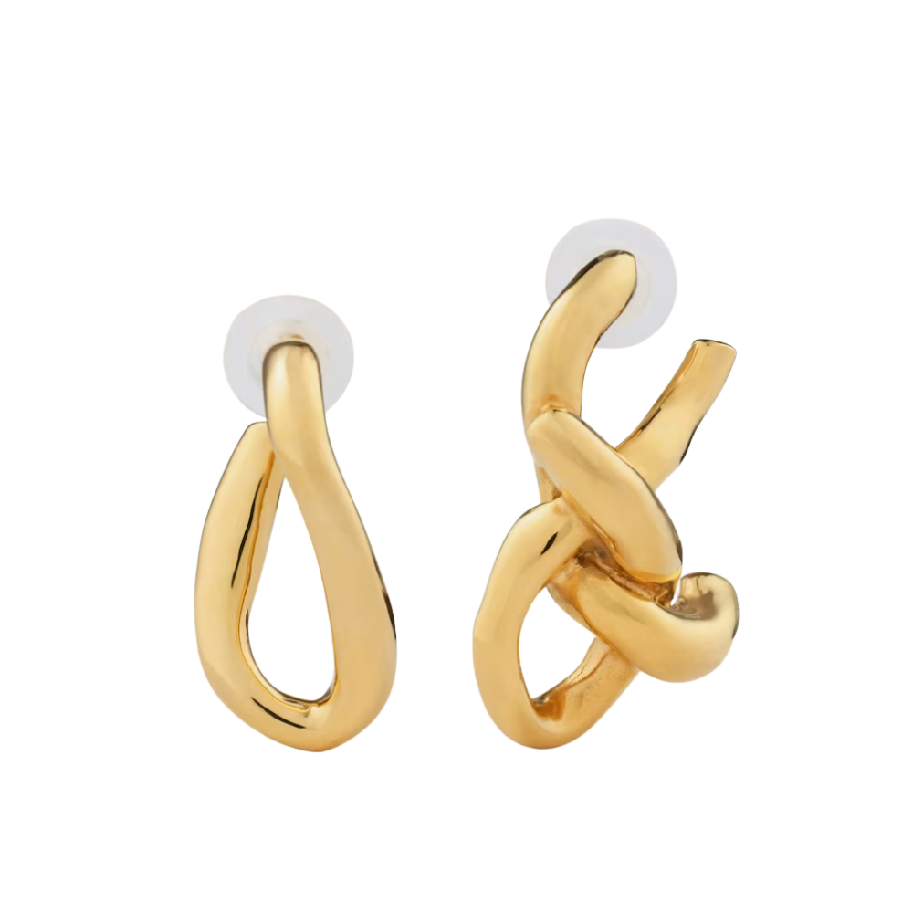
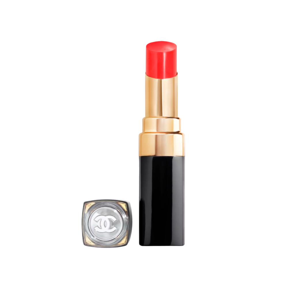
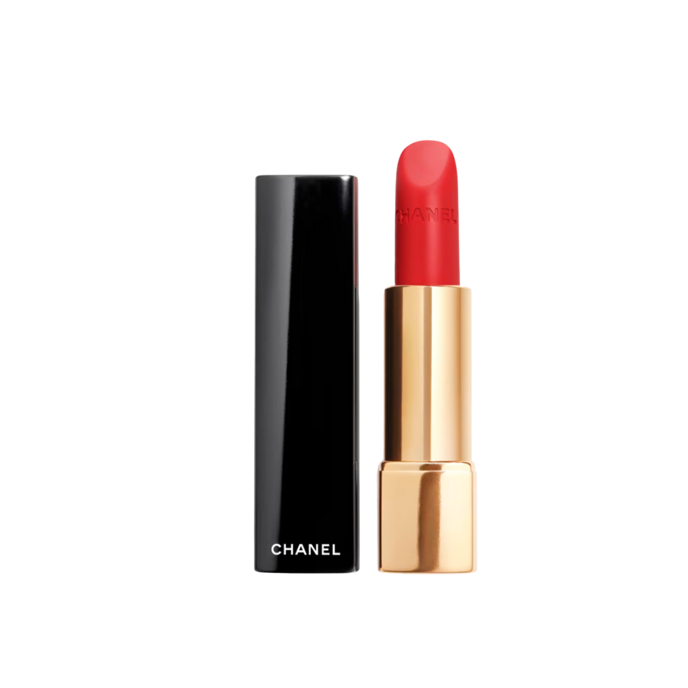
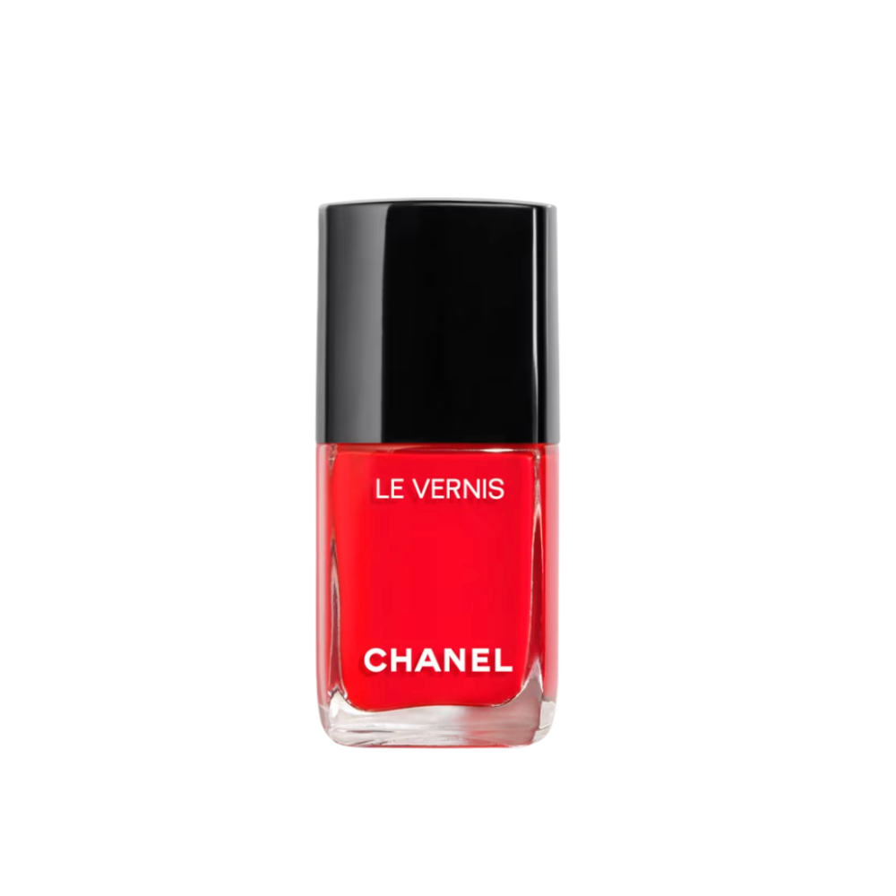
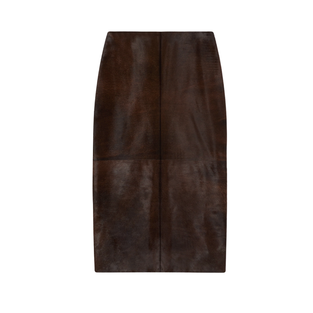
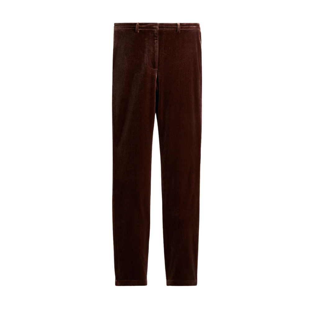
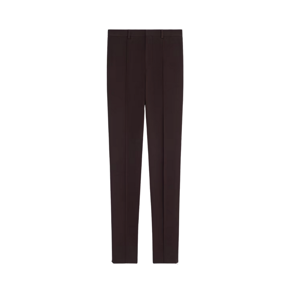
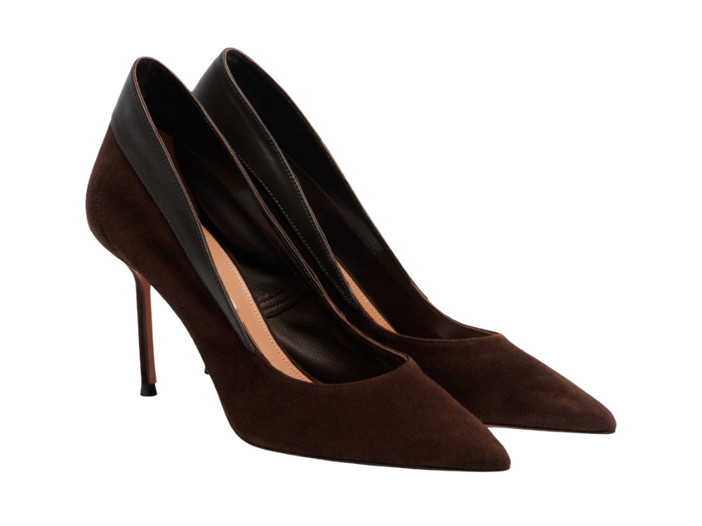
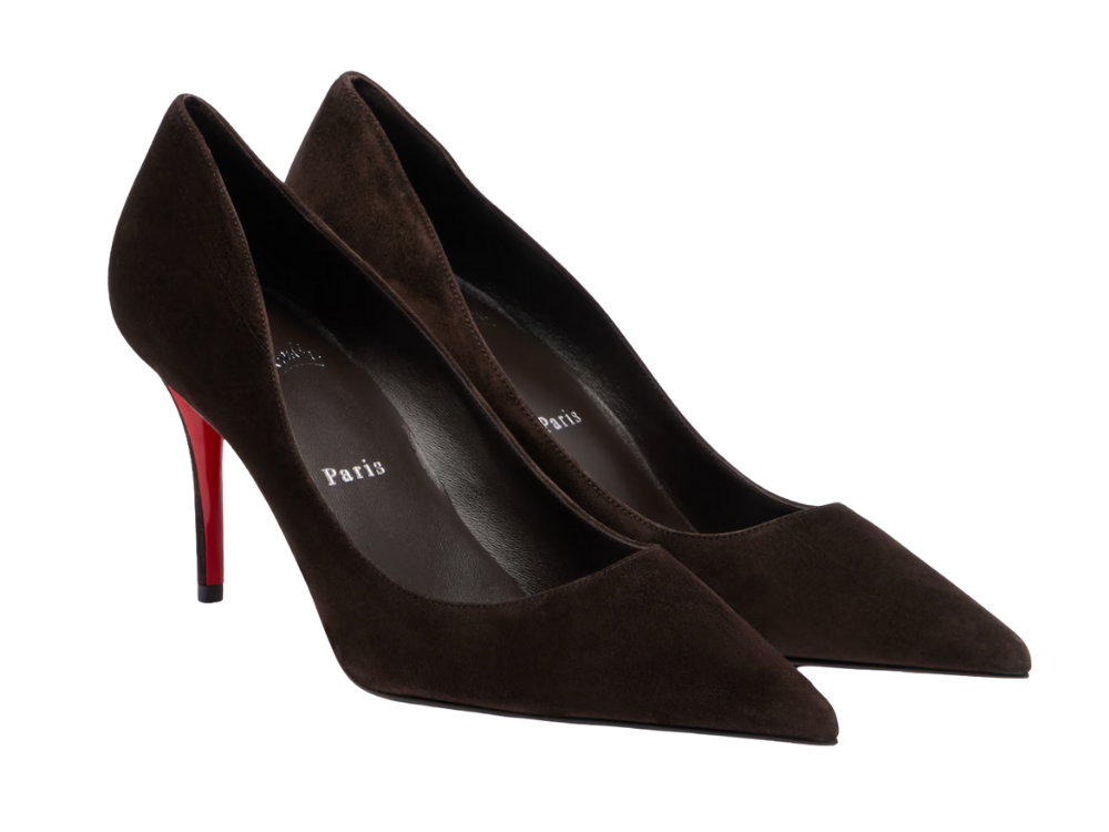
Brown comes first. It’s the trousers, the skirt, the coat—the piece that carries the weight and sets the authority. Pale pink follows on top, close to the face: a structured blouse, a fine knit, a crisp shirt, a draped jersey that moves but never flutters. The palette stays tight—brown and pink as the core—but it needs one point of tension. Gold jewelry does the work cleanly: earrings, a cuff, a chain that cuts through the softness without diluting the silhouette. When designers push it further (Prada, Giambattista Valli), the accent shifts to color—a red or burnt orange— which in professional settings can be explored and played with with a pop of color as a shoe, on the lips or nails. Fabrics remain matte and tactile—wool, suede, velvet, crepe, silk with body. The effect should be clear and legible at a glance, not busy or over-styled.
-
KSF
✓ Use brown as the base (bottoms or outerwear), pale pink on top
✓ Add at least one accent on top of brown-pale pink (gold jewelry and/or burnt orange / red)
✓ Choose muted, pale pinks (powder, blush, dusty rose)
✓ Only use gold jewelry as the default to sharpen the palette
✓ Favor structured or weighty fabrics (wool, crepe, silk with body)
Deal Breakers
❌ Don’t mix multiple pink tones in one outfit (exception: a brighter orange-leaning pink for lips or nails, if it suits your skin tone)
❌ Don’t pile on accents (red/orange is one touch, not a theme)
❌ Avoid flimsy, shiny, or overly romantic fabrics
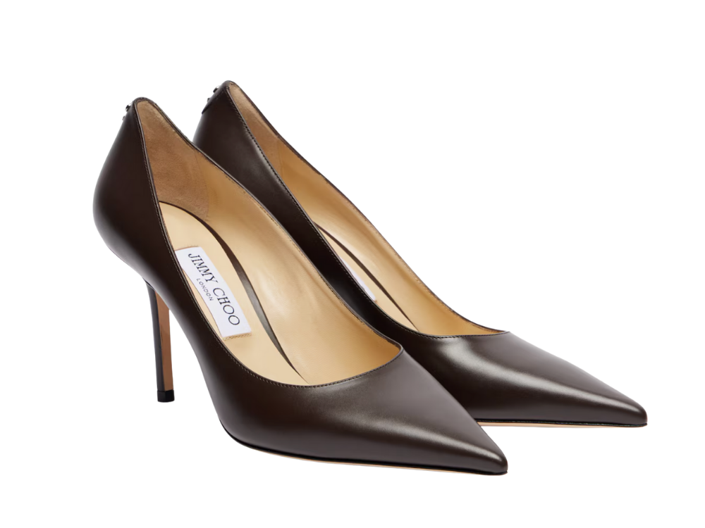
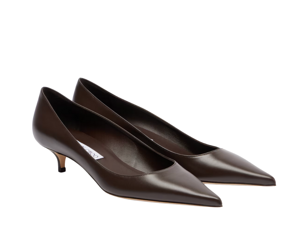
Shop the Edit


Pair it with Gold & Burnt Orange accents.